YOUR ART DIRECTION ASSET
Use mouse scroll or arrow keys to navigate
Slide to navigate
Working in the shadows
for your spotlight
Your sidekick is your secret asset. Here to listen, define what will suit you best to reach your audience, and build the solid communication you need.
This is not a systematic pattern, but the development of the specific answer for you, to create your very own spotlight.
Parisian Chapel
To celebrate its 15th anniversary, the Chapel’s community gathered testimonies and photographs. A public exhibit opened during the 2016 French Heritage Days.
Minimalist symbolism
The venue is unique: modern and asymmetrical architecture. Following this unpredictable dynamic, the theme color recalls the bricks of the façades, brought inside the walls. This brick symbolic goes even further in the design. The pattern of the background, referring to the community's members, represent those elements gathered with the same purpose of transcendence, getting lighter as they rise. To make the contents even more vivid, strong quotation marks give a voice to the walls.
Share an ideal
The end of things. refuses the sad planned obsolescence trend we live in. Their belts are made for people who believe in quality and brilliant engineering. Wearing them is taking a stand against ignorant consumerism, an action that goes further than the products themselves.
The business card rallies people around those principles. It talks to curious individuals who think for themselves. Twenty different lines were written, so the card perfectly matches who it is given to. The black and white design is proudly Manichaean. The short text adds mystery. The card is only a starting point, an invitation to go deeper.
The end of things. refuses the sad planned obsolescence trend we live in. Their belts are made for people who believe in quality and brilliant engineering. Wearing them is taking a stand against ignorant consumerism, it goes further than the products themselves.
The business card rallies people around those principles. It talks to curious individuals who think for themselves. Twenty different lines were written, so the card perfectly matches who it is given to. The black and white design is proudly Manichaean. The short text adds mystery.
Studenterhus fonden
Student restaurant and catering in Aarhus, Denmark //Art Direction, brand identity and content creation (naming, logo, packaging)
Win the lunch battle
For the students, a strict budget is part of the routine. How to convince them to spend it on a healthy meal, when the norm is only about cheap and fast?
Naming
Mint is the second name of freshness. It refers to the vegetal seasonning as well as refreshing drinks: this is the word that makes you want to sit at a restaurant at noon. Short, easily appropriated, it has this amount of obviousness that makes it part of your every day life in a glance. Let’s meet at the Mint.
Logo
The round inflated shapes scream ‘gourmandise’. The drops of water add to the freshness. You didn't realize, but now you're thirsty. The glossy green reminds you of the fresh vegetal presence, without needing too obvious images (enough leaves already!). The script font sets the logo on a human-scale level.
Alternatives for people with disabilities
The handco’s solutions aim to bring back autonomous choices in the daily life of those who experience disabilities. With competitive products made of unreliable plastic, a better alternative had to be offered.
Engineered for safety and comfort
Far from the common childish, rounded and colorful shapes to lure your affection, the brand addresses its users with straight to the point arguments backed by solid specifications. What I would call, indeed, respect. The graphics are clear, and built towards the sole enthusiasm of performance. The product speaks for itself. It is at the core of the message, no extra fuss required.
Selling images
As an interior designer, you offer technical guidance, and of course, good taste. What is more convincing than appealing results? The graphical chart underlines the delicassy and refinement you are looking for, with a language that can seduce both modern or traditional spirits.
Technical solutions for database users
Complexe questions do not have to be paired with opaque explanations. The challenge here is to propose refined processes as clear solutions to the user. Simplicity and minimalism will set the most welcoming atmosphere for this purpose, along with reassuring hand-drawings. See, it's easy.
The graphism is also adapted to fit Japanese habbits: spare web design, business cards including a free space to hold it with both hands.
Let's gather around common values
and share ambitions
We choose each other because we agree the following principles are the keys to a successful collaboration.
Bold design for ambitious branding
Only a strong, coherent and disruptive communication will impact your audience. There is no half-measure to stand out.
Choose your Sidekick wisely
Your art director is not just another link in the chain. Two individuals will never come up with the same ideas and design. Keep in mind the one you choose will deliver a very unique result.
Ethics and efficiency
You are asking for my expertise, use it. Instead of discussing 90's Word Art effects, let’s save time and be productive! Give me the lead on graphics and trust me to put my heart and soul into qualitative work. This is my passion.
Dear Sidekick,
Curious about who is at your side?
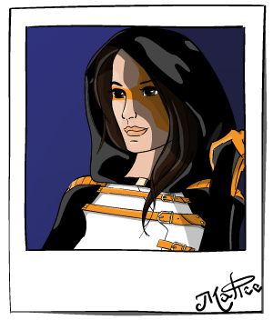
Since my architecture years, Mies Van der Rohe words resonate in me: "God is in the details". To construct a coherent message, from total design to pixel-perfect illustrations, is my leitmotiv. A coherent set of conscious choices has to govern every little thing. My graphical language is built that way, just like myself.
I invite you to visit my personal works to continue our meeting.

